Case Study #4324
Netspend Pattern Library
During my time at Netspend — a financial company that provides prepaid debit, banking services, and paycard solutions to millions of customers — we began to see a problem with consistency in the user experience. Through internal evaluation and user research, it was clear the existing patterns and components (primarily based on Google’s Material Design), needed to be standardized and documented.
Challenges to solve:
- Ensure the use of a consistent user interface
- Facilitate reusability
- Streamline the effort involved in updating and maintaining assets
- Refine current patterns and identify any gaps
- Identify redundant patterns
- Remove the friction of sharing with third parties
My role:
- Lead the design team in conceptualizing and defining content
- Direct and approve final design
- Collaborate with developers to answer their questions and document their needs
- Present work to team members and other stakeholders
Figma first
The final product was built in Figma, not an external website. This made it possible for the design team to use the inherent UI to organize and view the Pattern Library. It also gave us the ability to easily share with developers outside of the organization, as well as link to example prototypes, allowing the viewer to see the patterns in context. Updates to the Pattern Library were instantly cascaded down to the documentation level as well as all projects utilizing the library of components.
I recommended creating a Pattern Library directly in Figma and saw it through from ideation to completion.

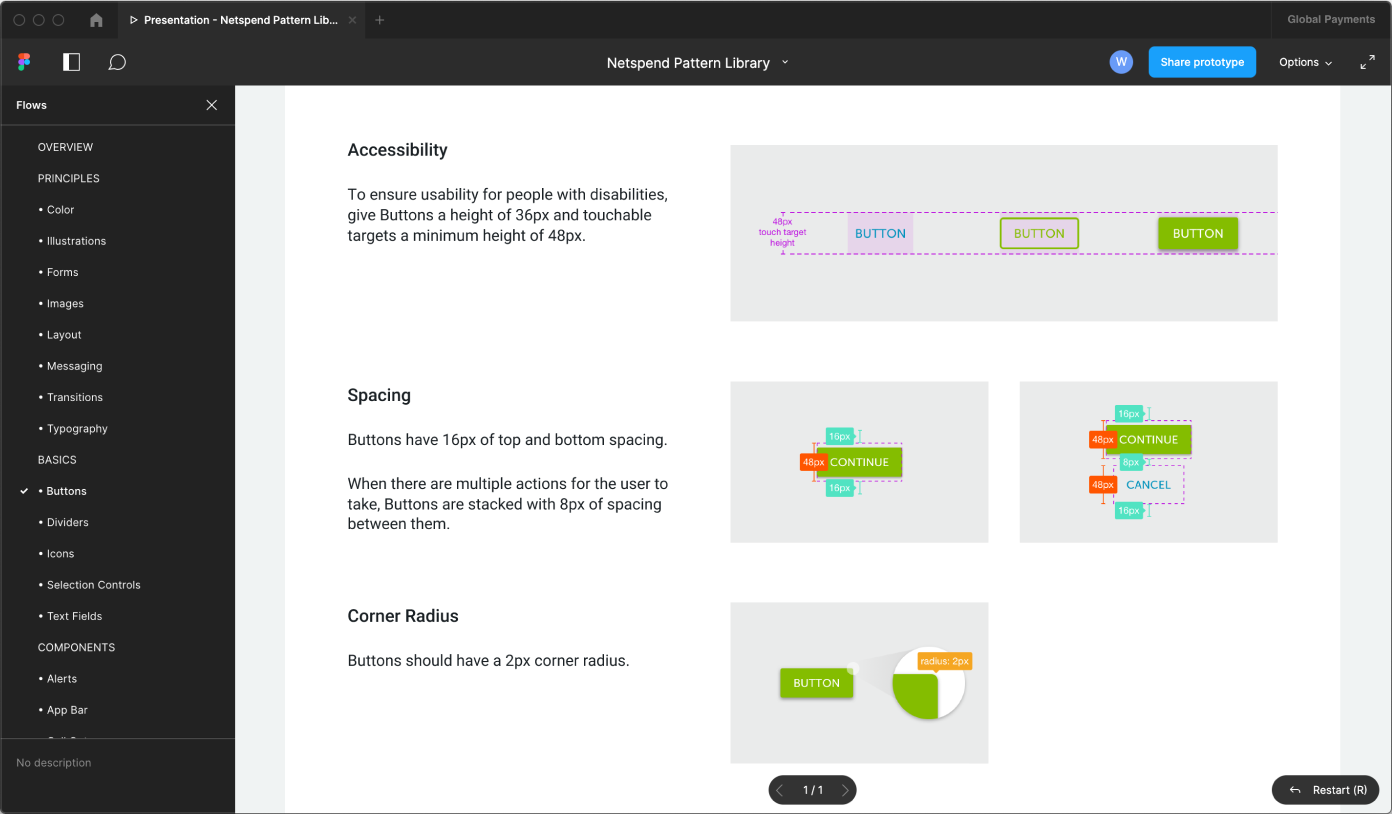
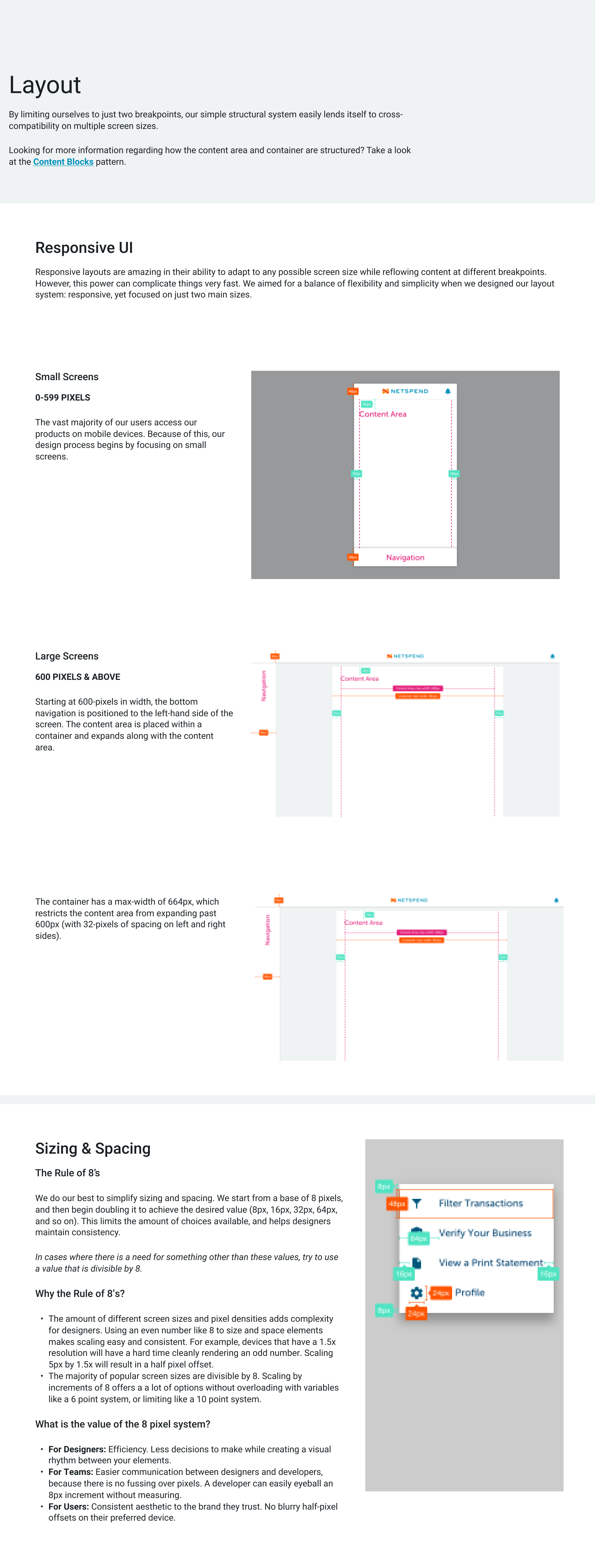
▼ Examples of component pages


How the pattern groupings are organized
The product team started by evaluating many existing Pattern Libraries. We wanted the tool to not just be a collection of user interface elements, but a way to learn and communicate how the design patterns are applied in real life situations. Fintech companies are heavily regulated so it is important to communicate the reasoning to the business and also share with the rest of the company. Ultimately we built a system that was based on GE’s Predix Design System, which was developed as they worked with the Atomic Design Methodology.
Principles
as the name implies, are the guiding principles that designers should reference and respect when creating new design patterns.
Ex. Colors, Messaging, Transitions, Typography
Basics
contain the design patterns that fall on the simple side of the spectrum.
Ex. Buttons, Icons, Text Fields, Selection Controls
Components
contain the user interface patterns that fall on the moderately complex side of the spectrum.
Ex. Alerts, App Bar, Lists, Menus
Layouts
are the documentation of a section or page
Ex. Empty States, Errors, Interrupts, Card Selector
Features
are the flows/systems that, when working together, allow users to accomplish a task or solve a problem.
Ex. Home Dashboard, Spend Tracker, Notifications, Disclosures

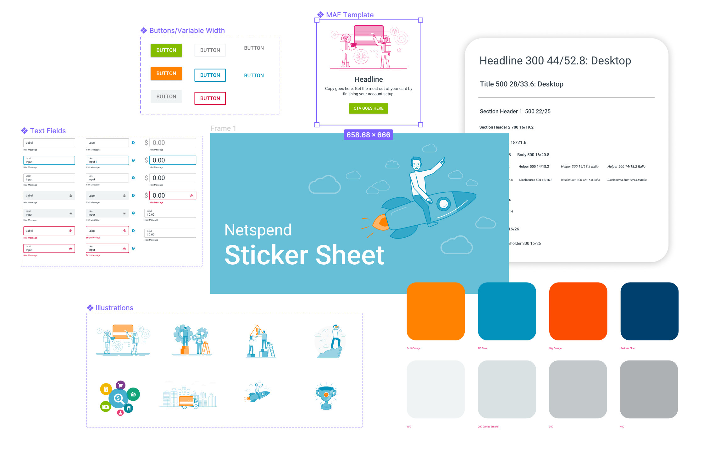
The Sticker Sheet
I personally engineered and developed the Netspend Sticker Sheet to serve as a component library for the entire team. The component library creates the management system that powers the pattern library. This made for easy updating and iteration – while keeping designers, developers and product teams on the same page.
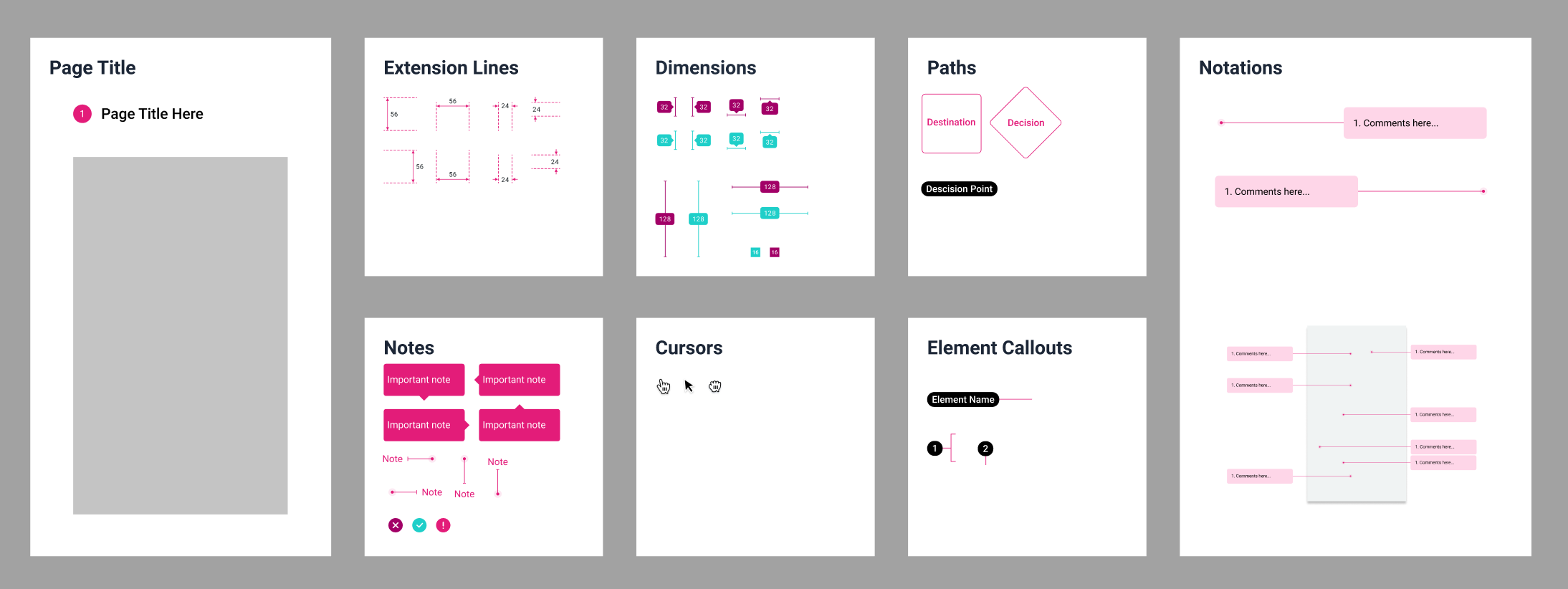
A common set of tools
Another problem to solve in the Pattern Library was consistency in documentation. We needed to create a uniform set of tools that allowed us to quickly mark up and explain how patterns were constructed and performed. Having these redline components quick at hand made the team’s tasks more consistent and efficient.

Key takeaway
Developing and maintaining both the Pattern Library and Sticker Sheet was a game changer for productivity and consistency for the product design team. With these parts and pieces documented, it gave designers more time to zero in on the problem, instead of creating the interface. The tool empowered the team to test more, iterate, and focus on the user experience. It also made communicating with the product and development team so much easier.
Netspend never had a comprehensive pattern library and set of components. When I came onboard, I was able to utilize my past experiences in developing design systems to help create a system to empower designers and get things done quicker and more consistently.
